


Html documents through the markup have a normal flow, this normal flow can be broken out from using two CSS methods namely Float and Position. Before we get started it will be helpful to have the following concepts in our mind. Floating an element simply means moving it left or right and having the following elements wrap around it while on the other hand Positioning an element means to move it anywhere across the web page with pixel precision. Normal flow refers to the CSS layout model where text elements are laid out from top to bottom or left to right as they appear in the source. In this scenario block elements stack upon one another and occupy the available width of the browser or another containing element, inline element line up next to one another and fill the block elements. When the window or containing element resizes, the block elements expand or contract to the new width, and the inline content reflows to fit.
FLOATING
As stated earlier this is simply moving an element as far right or left as possible.
float
Values: left | right |none
Default: none
Applies to: all elements
inherits: no
The values that can be given to the float method are either left, right or none with none being the default value. This method does not inherit i.e. if applied on a parent element the effect does not affect the child elements. An example will help explain this.
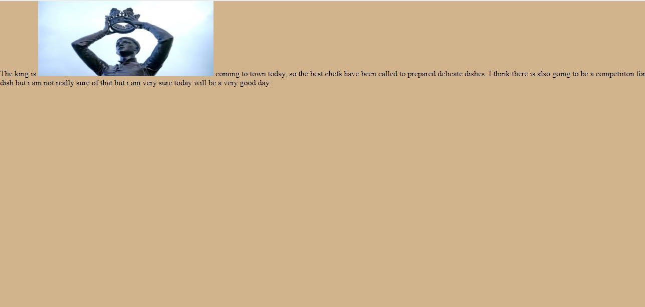
The above image shows the inline image in the normal flow.
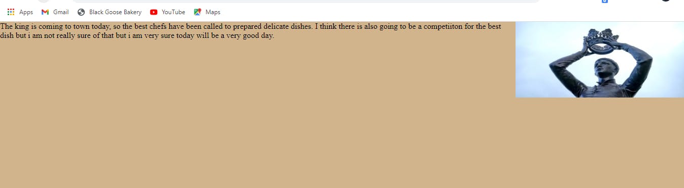
In this image notice how the text wraps around the image when it is floated to the right.
The CSS for this example is
img{
    float: right;
}
One quick take away from the above example is that even though the image has been moved form the normal flow it still continues to influence the surrounding contents.
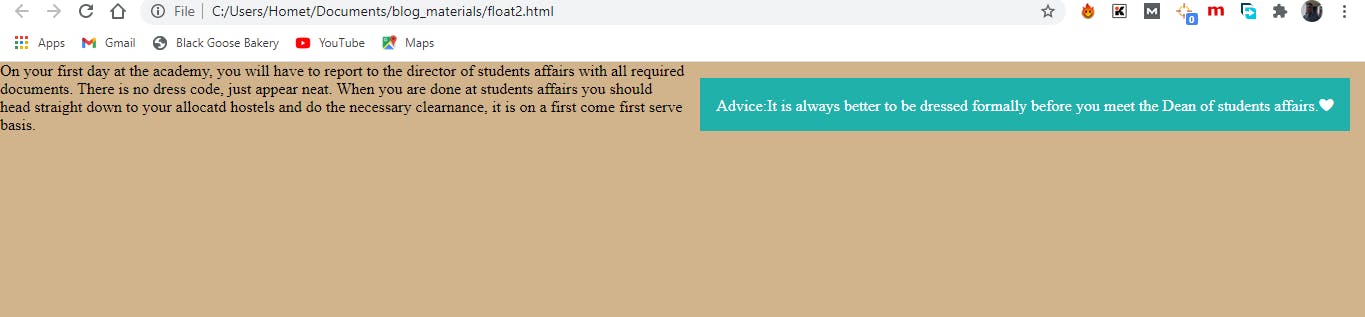
Floating an Inline text element.
Html Markup
<p><span>Advice: It is always better to be dressed formally before you meet the Dean of students affairs.</span>
     On your first day at the academy, you will have to report to the director of students affairs with all required...</p>
CSS Styles
span{
    float: right;
    margin: 1em;
    width: 200px;
    color: #fff;
    background-color: lightseagreen;
    padding: 1em;
}
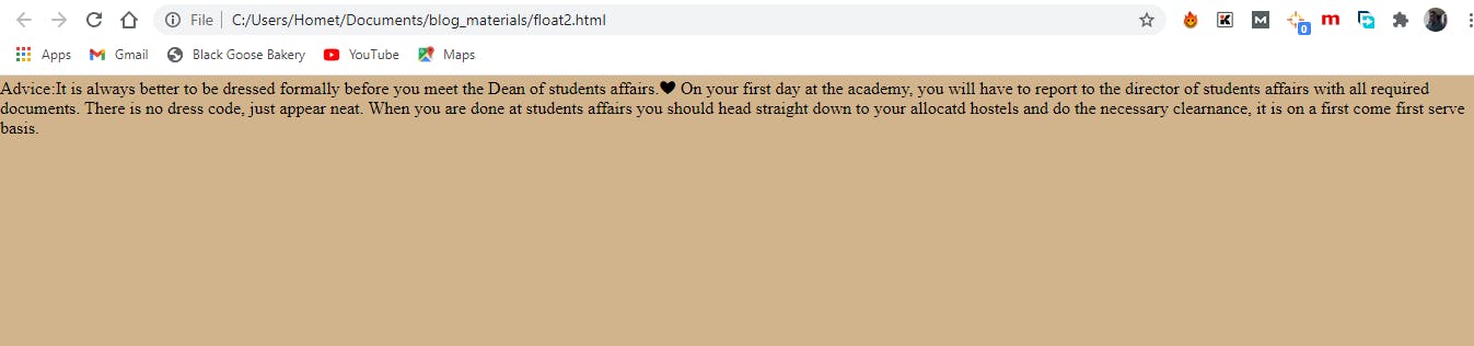
Without floating
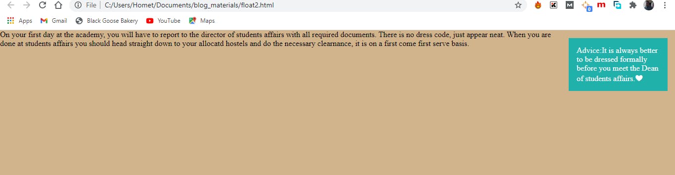 With floating
Looks pretty with the float right?.
This second example doesn't look different from the first one but I will like to point out some subtle points here.
- The style class for this second example includes a width. It is important to specify a width for inline text elements that you intend to float because if you do not the CSS box for such element will be sized wide enough to fit its content. Imagine how that will look for very long texts. Images come with their own inherent width, however we can still specify a width if we want to.
How the page looks like when the width is removed form the style class.
- The Second thing is how the floated inline text behaves like a block element. Typical inline elements do not have their top and bottom margins rendered but when floated the margins are held on all four sides.
- Margins on floated elements do no collapse.
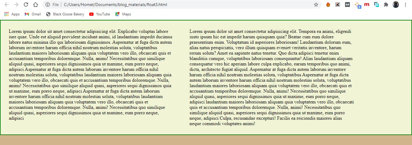
Floating Block Elements
Html Markup
<p>Mars is the fourth planet from the Sun and...</p>
<p id="float">Mars is the fourth planet from the Sun and...</p>
<p>Mars is the fourth planet from the Sun and...</p>
<p>Mars is the fourth planet from the Sun and...</p>
CSS Style
p{
    border: 1px solid red;
}

#float{
    float: right;
    width: 300px;
    margin: 1em;
    background: white;
}
 Without floating.
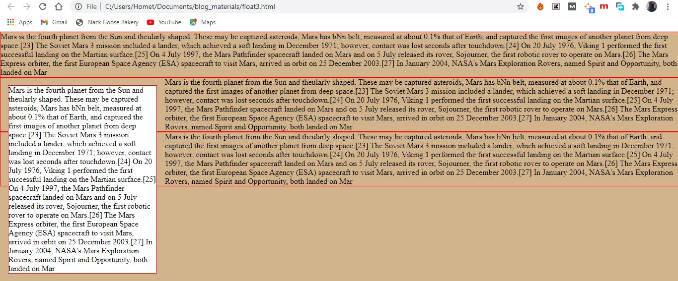 floating to the left.
I added a red border to the p elements so their boundaries can be visible and also added a white background to the floated p element to identify it. From the above image we can see the way that although block elements normally stack upon one another, this ones wrap around the floated image.
There are also some things to note when floating block elements.
A width must be provided for floated block elements for the same reason as you would for an inline element.
Elements that are floated do not go higher than their references in the source. i.e. They either move to the left or right relative to their position in the markup and therefore you cannot float an element to come above another element that comes before it in the markup.
Non floated elements maintain the normal flow- as can be seen from the image above. The p elements that have not been floated have their element boxes extending to fill the width of the browser and this is the reason why a padding on one of the p elements that have not been floated will result to space on the left edge and not between the p element and the floated text. Space between the float and the wrapped text can be provided by adding margin to the float itself.
Clearing Floated Elements.
From the previous examples we see that when an element is floated the surrounding elements wrap around it, sometimes we might not want this and prefer that the normal flow is used instead. This is where clearing comes in, applying the clear property to an element prevents it from appearing next to a floated element and forces it to start against the next available “clear” space below the float. The clearing is always applied to the element you want to start below the floated element and not the floated element itself.
clear
values : left | right | both| none
default : none
applies to : block level elements only
inherits : no
remember that the clear property is added to the element that you want to start below the floated element, the right value is to start an element below a right floated element , while the left value is to start an element below a left floated element. In cases where there are multiple float elements and you are not sure either to use right or left value you can then make use of the both value. The following example will help explain this better.
Html Markup
<p>
    <img id="lefty" src="images/crown.jpg" alt="">
    Lorem ipsum dolor sit amet consectetur adipisicing elit...</p>

<h1 id="clearance">All hail the  king</h1>
    <p>Lorem ipsum dolor sit amet consectetur adipisicing elit. Tempora ea animi</p>
CSS Style
#lefty{
    float:left
}

#clearance{
    clear: left;
    margin: .3em;

}
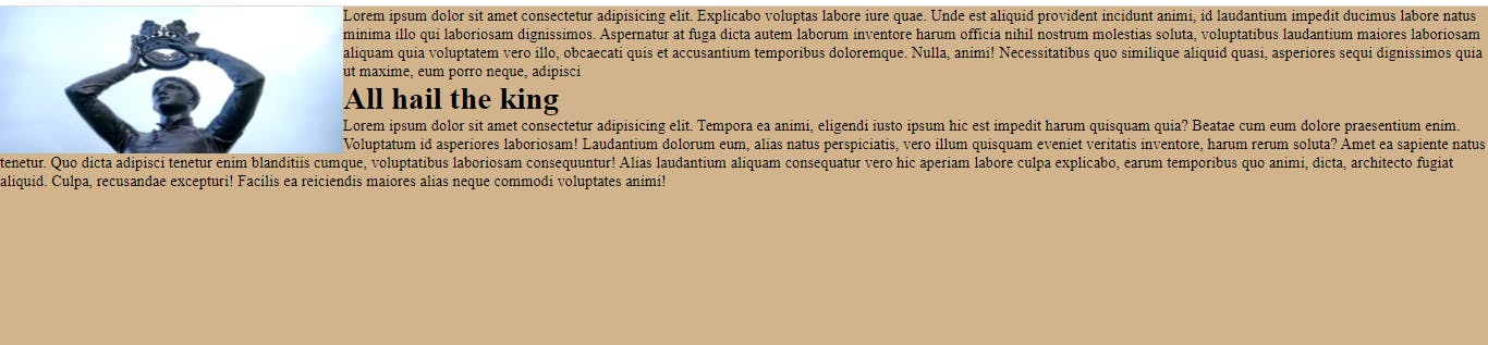
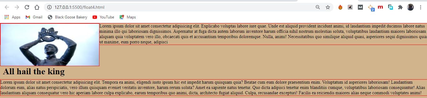
Without clearing.
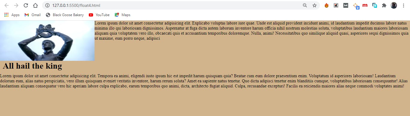 With clearing.
So far so good no troubles with float, however there is a little funny behavior that one might encounter using float and that is the issue that comes with FLOAT CONTAINMENT.
Containing Floats.
By default floats are designed to hang out of the elements they are contained in and this behavior is okay to allow text wrap around a floated images but this sometimes present an issue.
 notice how the image hangs out of the p element that contains it.
Since the containing element does not expand to accommodate the floated element imagine what then happens when we float all the elements in a container. What that will result to is that there will be no element remaining in the flow to keep the containing element open. An example will help explain this.
Html Markup
<div id="container>
  <p> lorem psum dolor sit amet consectetur adipisic...</p>
  <p> lorem psum dolor sit amet consectetur adipisic...</p>
</div>
CSS style
#container{
    border: 2px solid green;
    background: #f2f5d5;
}

p{  float:left;
    padding:2%;
    width:44%;
    border:none;

}
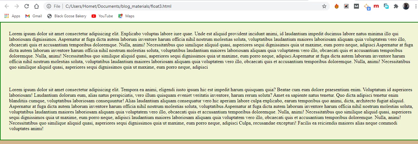
without float applied to both paragraphs
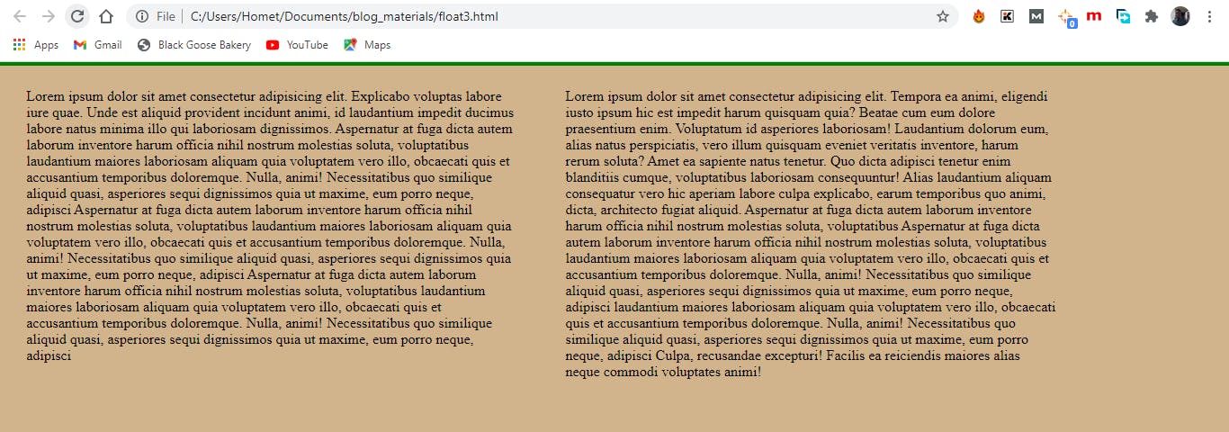
With float applied to both paragraphs, notice the green line at the top, yes you guessed right that is the border that we wanted to surround both paragraphs
Well that is obviously not what we want, luckily there are few techniques we can apply to prevent that default behavior. I will be using a very simple and straight forward one, where I will float the container itself and add a width of 100% then the container then has a style as seen below.
#container:{
      float:left;
      width:100%
      border: 2px solid green;
      background: #f2f5d5;
}
As seen form the image above the container now goes round the paragraphs like we intended.
POSITIONING
The float method discussed above comes with some limitations and this is evident from the fact that they can only move elements left or right relative to their initial positions. The CSS Position method overcomes this limitation as it allows for elements to be placed at any particular spot on the web page, either relative to its initial position or elsewhere entirely.
Position:
value: relative | absolute | fixed | static
default: static
Applies to: all element
inherits: no
The position property indicates that an element is to be positioned and specifies which positioning method to use.
relative: When a value of relative is given to the position method, the element box of the affected element is moved relative to its original position, when this value is used the initial space occupied by the element is still preserved.
absolute: When elements are positioned absolutely they are removed entirely from the normal flow and positioned with respect to the viewport or containing element. Unlike relative positioning the initial space occupied by the element is not preserved.
- static: This is the default position of any element and it is the way the elements are positioned in the normal document flow.
- fixed: fixed positioning of an element results in the element staying in one position in the viewport while the document scrolls. The element is removed form the document flow and positioned absolutely to the viewport.
Once you’ve established the positioning method, the actual position is specified with some combination of up to four offset properties. [top, ,right, bottom, left]. Each of this offset properties are given values which can come as length(rem or em), percentages or auto with the auto being the default. The value provided for each offset property defines the distance the element should be moved away from that respective edge. For example, the value of top defines the distance the top outer edge of the positioned element should be offset from the top edge of the browser or other containing element.
Relative Positioning
As stated above that relative positioning moves an element relative to its initial position in the document flow and in doing this the original space occupied by the element is still preserved and this still influences the layout of the surrounding elements. An example will help make this clearer.
Html Markup
<p>Alice sits on a riverbank on a warm summer day, drowsily reading over her sister’s shoulder,
      when she catches sight ...</p>
CSS styles
em{
    position: relative;
    top:2em; /*moves the element down*/
    left:3em;/*moves the element to the right*/
    background-color: tan;
}
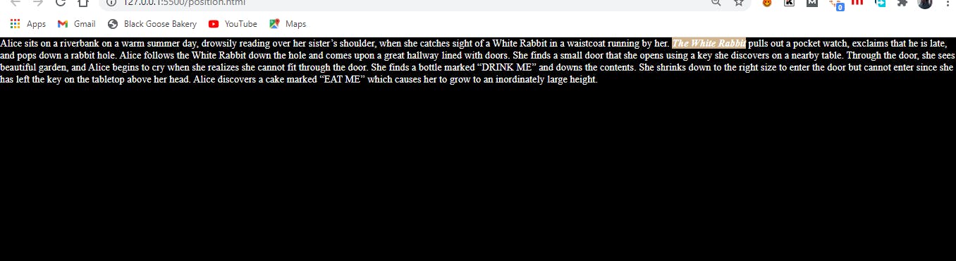
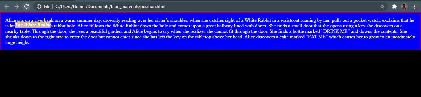
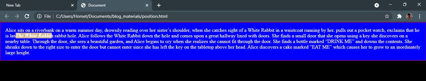
Before positioning was applied.
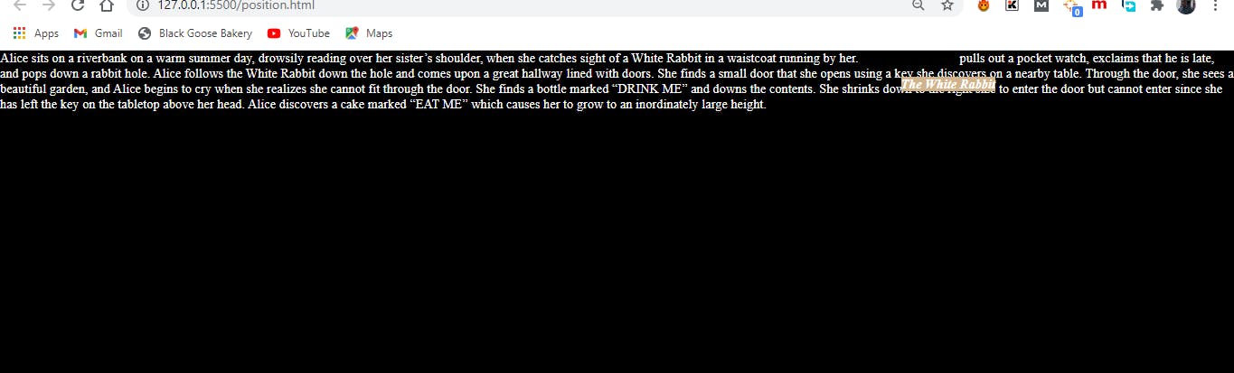 After relative positioning was applied.
There are two things I will like you to note here; notice how the initial space is still preserved and how there is an overlap between the words (The white Rabbit) and another word and this is because we are dealing with a positioned element there is potential for an overlap.
Absolute Positioning
The way absolute positioning works is quite different from that of relative positioning and will be best explained with an example. I will be using the same example as above to make comparison easier with only a slight modification in the CSS.
CSS Styles
em{
    position: absolute;
    top:2em; /*moves the element down*/
    left:3em;/*moves the element to the right*/
    background-color: tan;
}
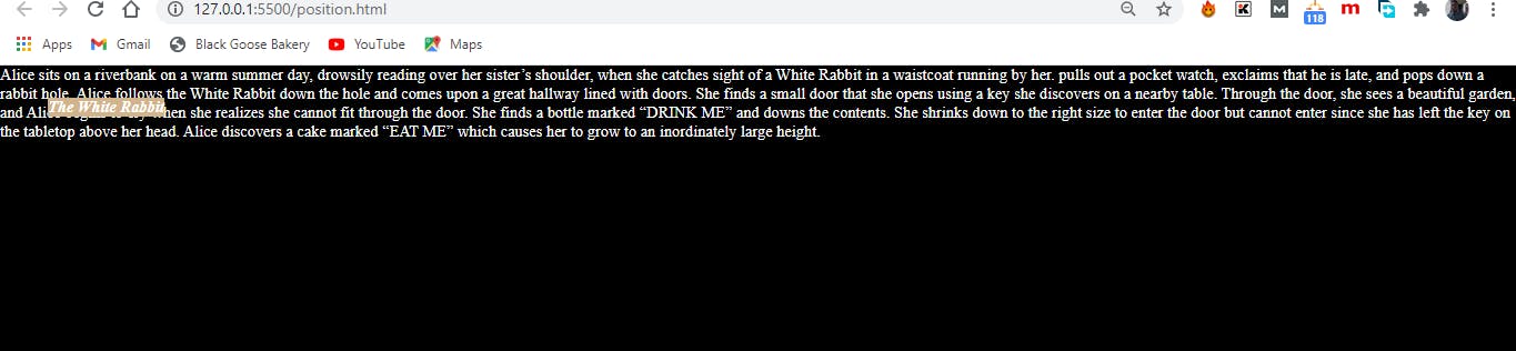
There are few changes here, perhaps the most obvious is that the former space occupied by the positioned element has been closed up and the positioned element has no influence on the surrounding elements. Even if that was the most obvious change, the most important difference between the relative and absolute positioning can be seen in how the element is positioned differently in the image above given the fact that the top and left values of the CSS are still the same. This time, the offset values position the em element 2em down and 3em to the right of the top-left corner of the viewport (browser window). Hey hang on for a minute I don't want you having the impression that absolute positioned elements are always placed relative to the viewport. What actually happens in absolute positioning is that the element is positioned relative to its nearest containing block. It just so happens that the nearest containing block in the above images is the root (html) element, also known as the initial containing block, so the offset values position the em element relative to the whole document. This might appear a little bit confusing so I will go over what containing blocks mean.
Containing Blocks
The position and size of an element is sometimes calculated relative to a certain rectangle called the containing block of the element and this is also knowns as the Positioning Context. Keeping things simple there are two important things two note when determining the containing block of an element which are:
If the positioned element is not contained within another positioned element, then the positioned element is relatively placed to the initial containing block which is created by the root html element.
If the positioned element however is contained within an element that has its position set to either relative, absolute or fixed, then the positioned element is placed relative to the edges of that element instead.
I will place a border around the p element to explain the above. The Html markup is still the same here I just included a red border
The above image describes when a positioned element is not contained with another positioned element.
To illustrate the second rule I will be making the p element a containing block simply by positioning it and I will be doing this by setting the position value to relative without adding offset values. A little note here, asides for regular positioning the relative value as we have seen just now can be used to create a positioning context for absolutely positioned elements. The image below, if you notice is positioned differently from the one above notice how the “a” and “later” is displayed in the two images. The Html markup is the same the only change is with the CSS styling.
CSS style
p{
position: relative;
padding: 15px;
background-color: blue;
border: 2px solid purple;
}
it is also good to note if an element is positioned absolutely it behaves like a block element and if a margin value is given to it, it holds on all four sides and once an element has been positioned it becomes the containing block for all the element it contains.
We have seen that positioned elements overlap other elements, this then implies that multiple positioned elements will most likely stack one another. By default elements will stack over one another the way they appear in the html markup but we can change this default behavior using the z-index property.
z-index
Value: number | auto
Default : auto
Applies to : positioned elements
Inherits : no
The value of the z-index can be any number either positive or negative. The higher the value the higher the image appears in the stack. A quick example will help explain this.
Html markup
<img src="./images/field.png" id="field" alt="">
<img src="./images/mountain.png" id="mountain" alt="">
 <img src="./images/road.png" id="road" alt="">
CSS styling
#field {
    position: absolute;
    top: 175px;
    left: 200px;
    }

    #mountain {
    position: absolute;
    top: 275px;
    left: 100px;
    }

    #road {
     position: absolute;
    top: 325px;
    left: 250px;
    }
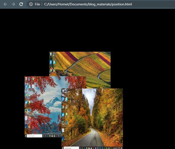
notice how the images are stacked on the page based on the way they appear in the markup
If the z-index value is added we can change this default behavior. Changing the CSS styles;
#field {
    z-index: 50;
    position: absolute;
    top: 175px;
    left: 200px;
    }
    #mountain {
    z-index:10;
    position: absolute;
    top: 275px;
    left: 100px;
    }
    #road {
    z-index:5;
    position: absolute;
    top: 325px;
    left: 250px;
    }
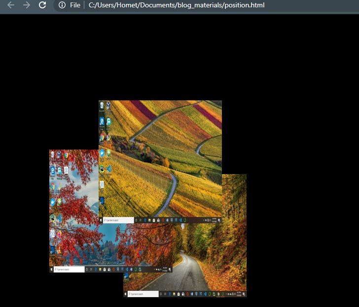
In the image above the stacking order has been changed.
Note that the values of z-index do not need to be sequential, and they do not relate to anything in particular. All that matters is that higher number values position the element higher in the stack.
Fixed Positioning
It is similar to absolute positioning but one major difference is that the offset values are always relative to the viewport, making positioned elements stay put even when the page scrolls. A good example is the case of a company’s logo staying in one position as the page scrolls up or down.
For an example on fixed positioning and more information about Float and Position you can check out W3Schools.
Thank you for reading. Please do share if you find this post helpful.